As a morally infallible artist it was only natural for me to join the protesters at Extinction Rebellion on Easter Sunday. Sat amongst the crowd having watched Greta Thunberg’s short and sweet speech I was urged to take part in the chant “We love you”. Sadly, as a cripplingly uptight young man these three words were too much for me and I quietly ate some bread instead. Having seen this inspiring young lady I emerged a climate-oriented me and cycled home on my non-carbon-emitting-two-wheeled-iron-horse. Whilst cycling with my head held high and illuminated by my newly acquired halo I couldn’t help but consider Green and Stone’s eco credentials. I knew that we recycled most of our rubbish (because I ALWAYS put it out! Rosie! I’m looking at you!) and I knew that our carrier bags are biodegradable, but I was sure there was more. So, I visited my local ashram and pondered, “How green is Green and Stone?”.
The answer came quickly, and the truth is, it is a real struggle for an art shop to be 100% eco. As artist’s we make use of all sorts of terrible materials and minerals for absolutely no logical reason. It’s inescapable! But hey ho, one line of depressing news is one too many. As I say, we recycle, we have biodegradable bags, and fortunately amongst our stock there are many examples of eco-friendly items!
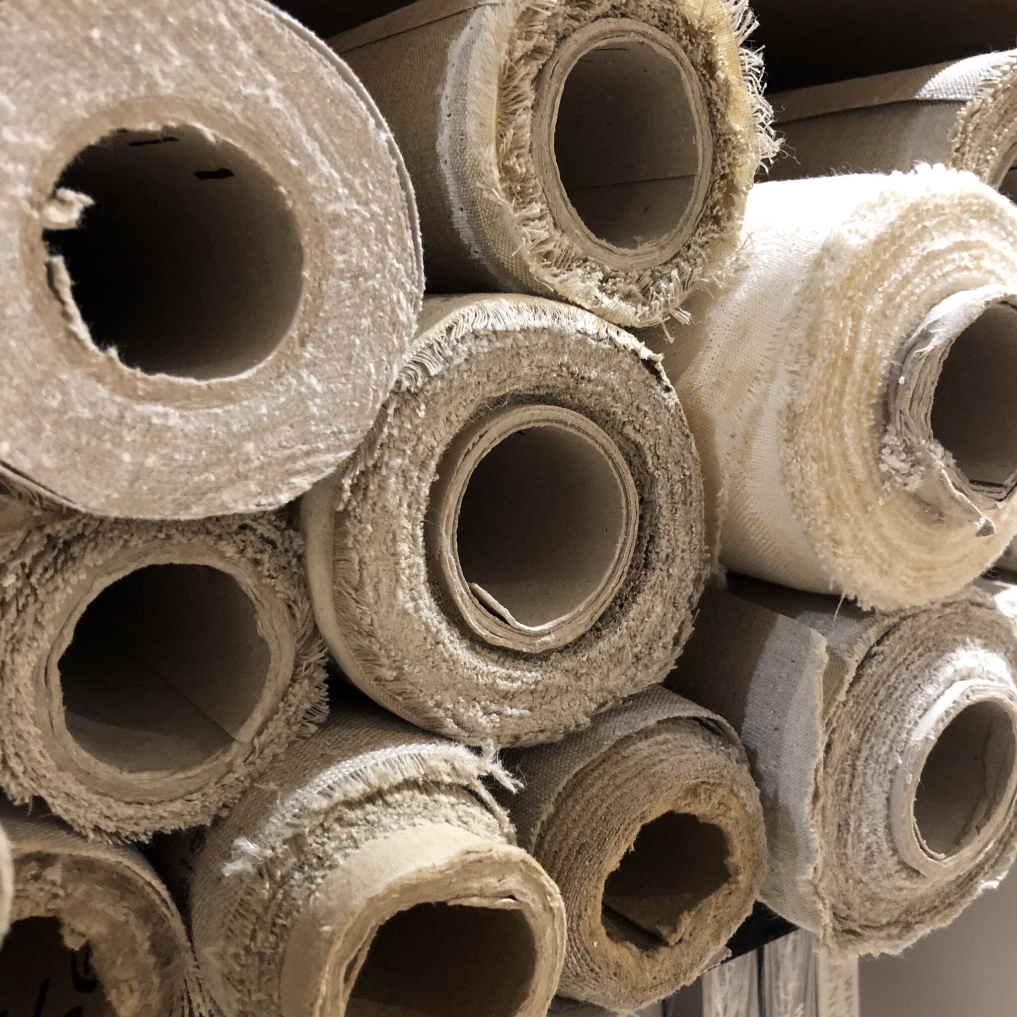
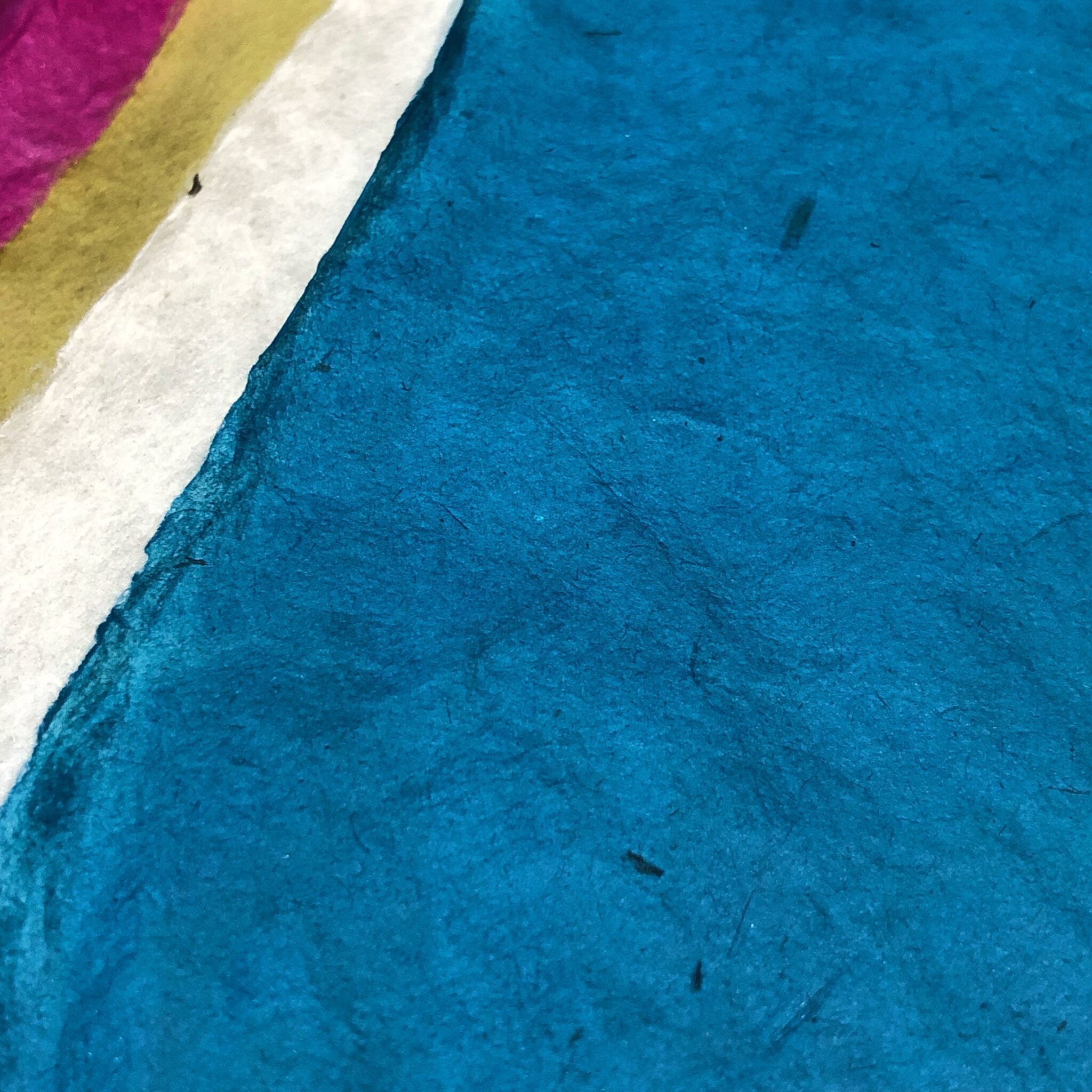
Amongst our selection of papers there are many which come from low-intensity, small scale, and environmentally friendly companies. Arguably, the most aesthetically pleasing papers we have in stock are, surprise, surprise, also the most eco-friendly! The paper I speak of, is the paper of Japan, India, Nepal, and Bhutan.
The papers of Japan are mostly made in the mountains where the climate is cold and the water is pure. The chilly climate means the ingredients to make the paper do not decompose whilst it also strengthens and contracts fibres, thus resulting in papers of a crisp, firm, and fresh appearance. Instead of using chemicals for bleaching, these paper-makers utilise the natural bleaching of the sun and of the river, the latter of which sees plant fibres left to whiten in clean and nippy shallow river beds. By using the river, the paper also picks up particles of mica which will let the paper sparkle just like the river from whence it came.
Most Japanese papers use kozo or paper mulberry fibres which are harvested sustainably. The result is a variety of papers with an inherent strength, warmth, softness, eloquence and attractiveness. Lens tissue and Tosa Washi are incredible examples of delicacy and strength, whilst Atsukuchi is a paper with a unique warm yellow hue. These papers are ideal for printmaking, but can also be used for pen and ink drawing, scrapbooking, bookbinding, and all sorts of experimenting!
Green and Stone’s Indian papers are similarly ecologically conscious. They are called Khadi papers, and they were inspired back in the 1920s by Gandhi’s Swadeshi movement which encouraged the resurgence of indigenous Indian craft and promoted the rights of Indians to embrace their own industries. These papers are very different to the Japanese papers which tend to be light and refined. Instead, Indian papers are robust, perhaps less delicate pieces of craft, but nonetheless they are very beautiful, and good for the planet.
The rag papers are made from 100% cotton rag which is recycled from t-shirt cuttings. Despite the rustic look, Khadi rag papers are still acid free with a pH neutral size thus making the papers supremely excellent for watercolour, gouache, and ink. The interesting texture of the paper also lends itself to expressive, organic drawing. Oil paint is even suitable if you prime the paper with acrylic gesso!
Other papers in our Indian Khadi collection include the delectable khadi coloured papers, which come in one of the most beautiful shades of magenta, and are excellent as wrapping up paper or general crafting. They too are eco-friendly, being made with dyes which meet European standards on toxicology. The eventual intention of the Khadi paper company is to reduce or entirely avoid the use of dye by recycling t-shirts of certain colours for certain papers. We also sell hemp papers made from sunn hemp, a native fibre used in India in the past for rope making. These are heritage papers made using traditional methods with the consciousness of nature in mind.
Bordering India are the mountain countries of Nepal and Bhutan. Nepalese and Bhutanese papers are made from the inner bark fibre of lokta plants that grow in the forests of the Himalayan foothills. The plants are harvested every three to four years, and are allowed to re-grow from their main root, thus meaning less disruption of soil and greater biodiversity. These Nepalese papers are the only papers made in Nepal using soda ash instead of harmful caustic soda. The run-off of this soda ash can then be used as a fertiliser so the environmental impact is actually positive! These methods have hardly changed for over one thousand years. The papers are an excellent example of the Buddhist reverence for the nature, from which we can learn much!
Beyond paper we are also proud stockists of St Eval candles. This company, based in Cornwall, takes the environment very seriously indeed. They not only re-use packaging, source FSC Certified paper, and reduce plastic-use generally. Their energy sources for production include wind turbines, solar panels and biomass boilers. On the farm on which they are based they have worked with the RSPB to create a network of mixed arable fields, wildflowers meadows and hedgerows to sustain populations of insects and bees. This all means that St Eval candles, which smell so heavenly, are close to being a completely carbon neutral company! Something one can only salute!
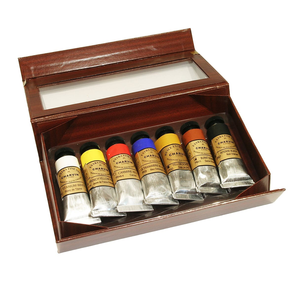
The final exemplar of small-scale excellence is Mr. Abraxas who makes Abraxas Inks. Yes, these inks, which are made solely with natural materials are all made by one man. Not only are they unsurpassed in terms of the aesthetics of their packaging, their colour is incomparable. The range includes oak gall inks, saffron and carmine inks, and pure vegetable inks. They are all mixed by hand! By a wizard (maybe!). They are completely non-toxic and are produced on a base of pure water. If you really wanted to, you could probably drink them. But what would be the point…
So, whilst it is nearly impossible for Green and Stone to call itself an eco saint we do at least try! We are very proud to sell these eco-friendly products, but there are many products I haven’t mentioned; other papers, other inks, other gifts. But what I should also say is that almost all our stock, even if they use not-the-nicest materials comes from small-scale suppliers whose carbon footprint is always going to be much smaller than those of larger corporations whilst also providing a higher quality, typical of people who really care for what they do!
And my last point is, don’t pour turpentine down the sink!
By Ned Elliott