Long ago, on a blustery Mediterranean shore, an ancient Roman man slipped and slid across a crumple of rocks in search of booty. After some time, the sodden man found his treasure in a gently lapping pool. Looking down into the octopus’ face the man said, “O poor little octopi, already so delicious and sweet, you are so perfectly exploitable for my own artistic expression.”
And the octopus shed a tear.
*
As our introductory story illustrates sepia is a natural and ancient pigment. It was Cicero in 45BC who first recorded the use of sepia for both drawing and writing in his De Natura Deorum. The famous orator kindly and concisely explained how sepia is made by removing and treating the contents of the ink sacs of various sad cephalopods including cuttlefish and octopus. This makes sepia a strictly non-vegan art material! If you are a vegan, don’t fool yourself! Maybe don’t even read this blog!
True sepia is used exclusively in watercolour and ink as it does not respond well to oil or acrylic. When presented as “sepia” in these latter mediums it contains a mixture of other pigments trying to replicate the rich brown of the real thing. As we don’t deal in knock-offs at Green & Stone we will no longer mention these pale imitations! The true brown of sepia is semi-transparent and depending on its dilution it ranges from a very dark and powerful brown to a delicate glowing light wash. In comparison to the cool greenish-brown of bistre, sepia is a warm reddish-brown similar to burnt umber.
Sepia enjoyed its heyday in the 18th and 19th centuries when it was used by such greats as Turner and Van Gogh. Nowadays, it is not so popular due to its semi-permanent nature. However, this pigment is brilliantly dynamic and exciting to use and if you don’t leave it baking in the sun it’ll be preserved for posterity (see Turner and Van Gogh!).
As mentioned before sepia is used exclusively(!) in watercolour and ink, but in my own wretchedly humble opinion it is most enjoyable as French sepia ink which is an ink mixed with a shellac base. In this form it has a waterproof satin finish. Mixed with shellac the ink gains a light viscosity which, when used with a brush, feels rather silkier and softer than say, Indian ink, and also gives it a little more visible body which shows, when dried on paper, the way one has used their brush. Furthermore, the shellac seems to add to the glow of sepia, giving it extra liveliness. Indeed, having just used the French ink a customer came in and exclaimed, “It’s so dynamic, look!” as she gleefully thrust her paintings in my face.
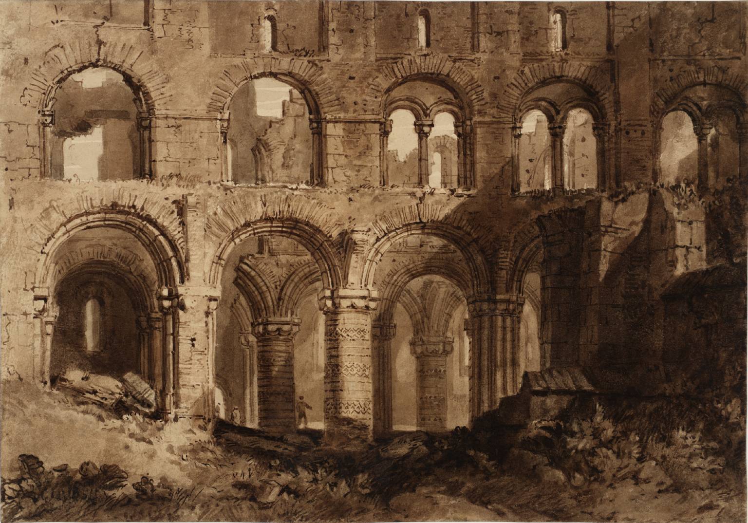
In Holy Island Cathedral (pictured) Turner perfectly shows the depth and range of the “colour” and tones of sepia watercolour by highlighting areas of contrasting light and shade in the ruins. Indeed, sepia is perfect for making monochromatic tonal studies and sketches in preparation for larger works of art in different mediums.
Where Turner mostly used sepia for watercolour painting Van Gogh used it for drawing with a reed dip-pen. Van Gogh’s drawings of peasants farming and trees swirling highlighted the raw, earthen, toilin’ in the fields look of sepia. Undiluted, Van Gogh’s dark mark-making perfectly reflect the warm and gritty rurality of 19th century France.
What more is there to say about sepia? Only to try this slightly maligned colour out, for sketches, studies or full-blown masterpieces!
By Ned Elliott