With the days getting longer but somehow the month feeling gloomier it is only natural to pine for summer, both past and future, and the warm joy it brings. Undoubtedly, there is no greater pleasure than jumping into a tree-lined river, throwing yourself under its sun-dappled waters, then lying on the tickling glistening grass and basking in the sun whilst water steams off your pale-turning-brown body. Away from the river another highlight of my England-bound months of smiles was the Charmed Lives in Greece exhibition held at the British Museum. Alongside boys lying in fields of asphodels, slowly drifting into the arms of Morpheus, were a selection of small portraits of Cretan and Greek men, women, and children. Here John Craxton, a British artist who for much of his life exiled himself to Greece (tough life!), not only made me jealous of his Mediterranean gallivants but he also opened my eyes to the world of toned paper! Truly exciting stuff!
Before my eyes were opened by Craxton I lived as an ignoramus blindly wandering around Green and Stone thinking the only paper for me came white, phosphorescent and bright, and that toned paper was exclusive to pastel painters. But no, such paper is open to all – whether you use charcoal, pencil, coloured pencil, conté or pen and ink!
Toned paper comes in all sorts of colours ranging from light creams, bold greens and rich reds. Whilst Craxton enjoyed all sorts of colours of toned paper in the Renaissance we find that light browns and greys were most popular with the likes of Michelangelo and da Vinci. What all these artists understood, whether 15th century, or 20th century, was that toned paper can greatly enhance a drawing.
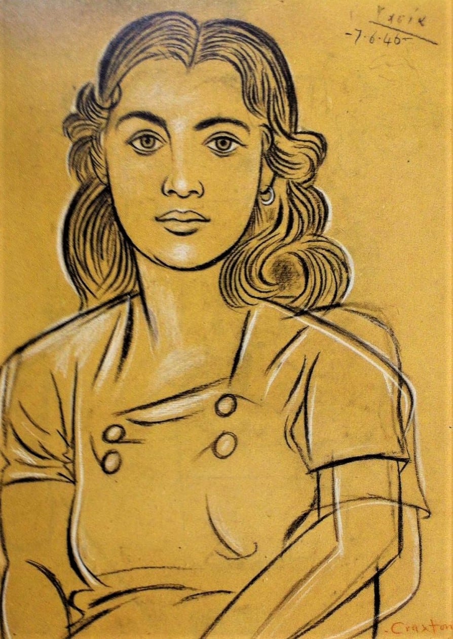
Having such a choice of delectable colours to draw on allows you to set the mood of your drawing more easily. Whilst Craxton often chose warm tones of yellow and orange he equally favoured cooler ones of grey and blue. Having the constant unifying mid-tone also allows one to darken and lighten their drawings more easily. Indeed, this sort of highlighting which can be done in white charcoal, chalk, white ink, or dry-ish gouache can be more difficult to achieve when drawing on white paper and to some extent allows a more realistic bodied drawing, as when in nature do you ever really see stark white in nature? Equally, coloured paper can lean one further towards abstraction. The constant mid-tone can also grant you wicked speed as the paper does much of the shading work for you, making it perfect for travelling and quick sketch making. Craxton’s ‘Tasia’, a portrait of a Cretan lady drawn in conté, is a beautiful example of the dynamism of toned paper. The paper highlights her warmth, spiralling hair and extraordinarily captured features. No doubt Craxton could have achieved this otherwise, but the paper helps! Finally, using toned paper encourages unusual colour combinations which can prompt all sorts of effects, moods, and experiences.
The only things that will upset toned ‘pastel paper’ is the wet, whether watercolour or acrylic, it will squirm wildly and lose all dignity and be a terrible waste. However, relatively dry gouache and the delicate wetness of pen and ink is perfect. Fortunately, watercolour does come in its own range of hues comparable to those mentioned here.
So next time you think about paper, don’t only think of it as white, at Green and Stone in the ‘pastel paper’ stand it comes in forty different colours (not counting all the other types of card and paper) ready to be made into whatever sort of drawing you like.
By Ned Elliott