
‘Meconopsis’ (2018)


It’s sunny, my skin is being gently caressed by the sun and my hair is flowing handsomely in the sea wind. I am driving somewhere along the Cote d’Azur having eaten something delicious at a small seaside restaurant. My car is a gleaming scarlet convertible from the Golden Age of Motoring. It is very expensive and I am gliding across the landscape like a knifeful of strawberry jam across a freshly sliced piece of buttered baguette. I can’t help but look in the rear-view mirror and think how damn gorgeous I am. However, I am soon distracted, an unmistakable smell penetrates the salty pine-infused air. My heart is suddenly stung by memories of disappointment, rejection, dashed hopes, ah, yes, art school! But no, there is more, I remember my unwavering love of painting! Suddenly I am filled with the electric buzz of seeing a picture come to life. ‘What is it! What is that smell! What is it!’ I scream from my beamer. It is the smell of fresh poppy oil, but what exactly, oh yes, Charvin, it is you, I love you! I do!
*
This introduction was written from my cold bedroom.
I do not have a car, and I have never been to the south of France. But I have smelt poppy oil, and I have used Charvin. And so, this blog is about Charvin, whose essence I have hopefully captured in this paradisaical opener.
*
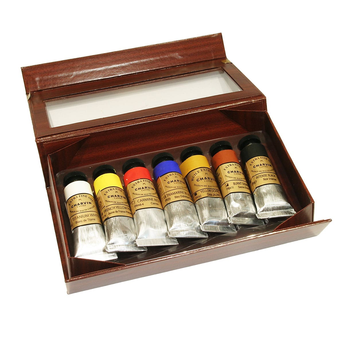
At Green and Stone we sell several types of oil paint including Michael Harding, Sennelier, Winsor and Newton, and Blockx. All of them are good, but the most unusual of the paints is Charvin.
Charvin is solely made on the French Riviera. Much of the products charm lies in its heritage. It is a family business run by Bruno and Laurence Charvin and relies on recipes from 1830. It was popular with such greats and lovers of sunlight, Cezanne, Bonnard, and Ambrogiani.
Charvin sells both fine and extra fine oil colours. The difference between the two being that the extra fine oil is milled twice as long as the fine oil, with discrepancy on timings for each pigment. The machine used is a Buhler Swiss Three-Cylinder which is typically used for the manufacture of high-end cosmetics. The outcome is an incredibly smooth oil paint with a thick, creamy texture. In the extra fine range there are a staggering two-hundred-and-eight colours of which Green and Stone sells ninety-six and which is constantly changing. This means Charvin oil paints have the widest range of colours in the world including such delights as ‘Cyclamen’, ‘Absinthe’ and ‘Mummy Brown’. Whereas Sennelier relies on safflower oil, and Michael Harding on linseed oil, Charvin uses poppy oil. By choosing this oil the paints have a lovely shine, are excellently lightfast and should age without any yellowing. With their buttery and fine texture, the paints are perfect for the traditional Flemish painting style headed by such estimable figures as Jan van Eyck and Rogier van der Weyden. However, they are equally suitable for painting using colour shapers and palette knives, whilst the small 20ml tubes are ideal for the keen traveller and plein air painter.
Charvin paints are also unusual in that they mostly come in mixed colours, in stark contrast with Michael Harding who emphasises the importance of pure single pigments. Charvin are aware of this and suggest the artist picks their colours carefully and that they do not overmix them, as they warn they will take on a shade of grey upon drying.
The understated jewel in the Charvin crown of rainbow jewels is their oil-primed linen canvas, whether on the roll or ready-made. The linen is of a medium to rough grain with a characterful texture which reminds one of the sorts of canvases someone like Walter Sickert would use. The ready-made canvases come in traditional French portrait formats, as well as squares and elongated rectangles. They are handmade by talented Frenchmen who deftly wack copper tacks into the sides and firmly stamp ‘CHARVIN’ onto the back. The result is a canvas of the highest quality with a rigid structure and evocative 19th century look. Why use staples, when you’ve got tacks!
The final aspect of Charvin which makes it so excellent is the philosophy of the owners. Indeed, Charvin are very much a business on an ethical crusade.
In their own words they are a family business ‘rejecting the plasticization, consumerism and delocalised mass production to which the world of fine arts is engulfing’. With a business model they consider ‘utopian or crazy’ they have chosen to use raw materials only of the highest quality without any real economic outlook at their cost. They are against people who only think of profits and margins, who make low-quality products for low-cost countries, simply to gain a foothold in the market without regard for the ethical consequences and the repercussions for art itself. They work for authentic values and true products of meaning.
As part of this crusade Charvin have stressed what they are against. In brief, they are against; colour range reductions (hence their rainbow colour range); the use of average ingredients; cotton canvas – an unreliable material over time, lacking the charming texture of linen. Why use cotton, when you’ve got linen! And finally, they are against online shopping. Arguing it means the end of advice, replaced only by a better price – thus resulting in a user who cannot progress in their work. The knowledge of generations being lost little by little.
And so, long may Charvin reign in the sunny south of France. A beacon of artistic heritage and quality artistic production, keeping the French oil painting tradition very much alive for all the world.
By Ned Elliott
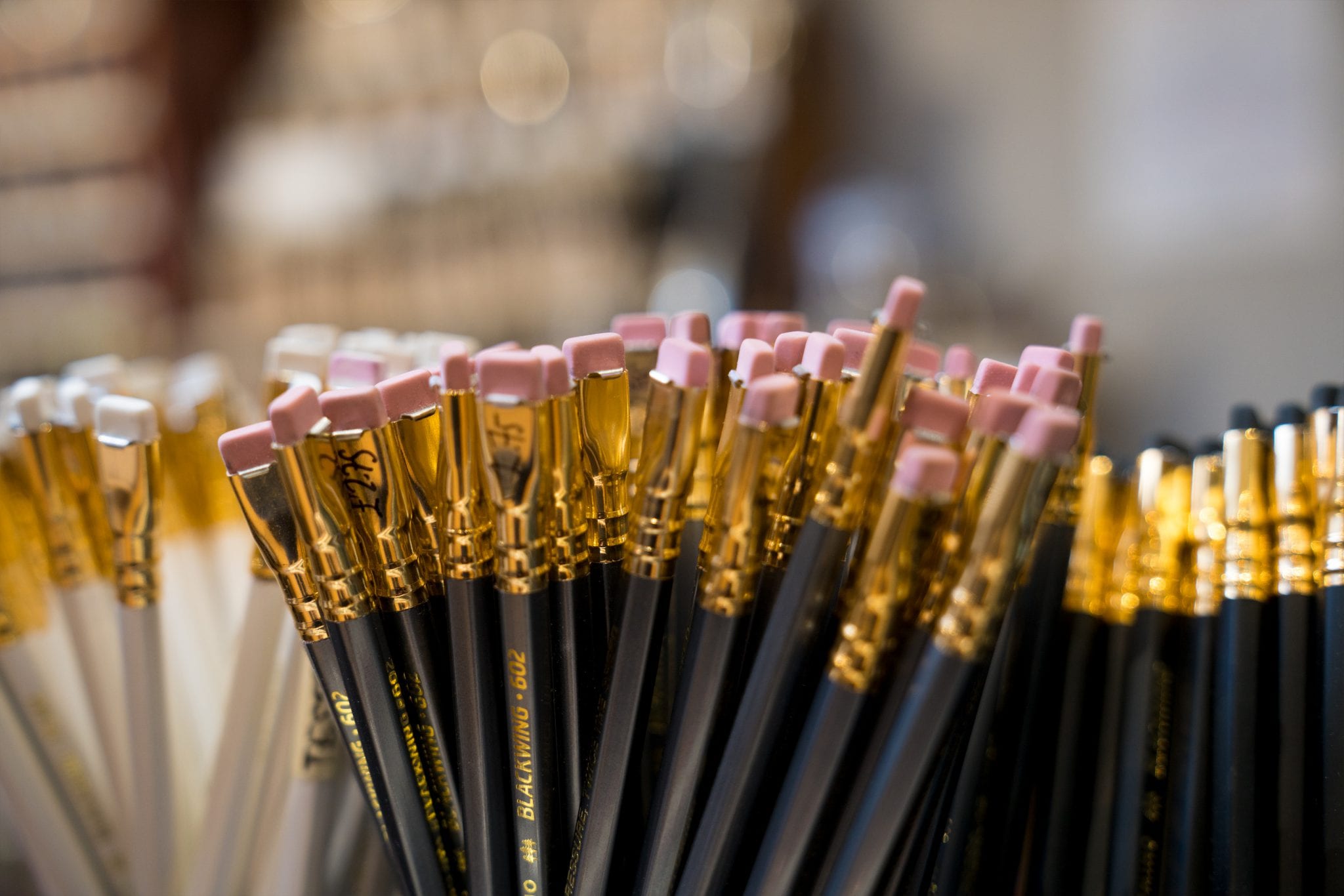
2B or not 2B, that is the question.
Indeed, it truly is the question when stood in the menagerie of pencils that is the downstairs rabbit warren of Green and Stone. In this place a cornucopia of pencils awaits you, including everything from the humble school pencil to the most suave, dark, and mysteriously named Pierre Noire.
First and foremost in the collection are the graphite pencils whose sheer variety of shapes, sizes and qualities will surprise those who think of pencils as merely being striped like a wasp and stuffed sadly in a neglected and shadowed drawer.
Particularly prized in the collection are the Caran d’Ache Grafwood pencils which have both style and substance. On their style, the silvery shafts are coloured in accordance with the graphite grade and have a hexagonal shaft to suit your grip, thus completing a sartorial draughtsman’s look (very important!). On their substance, the graphite is of the highest quality and is delectably soft and smooth, even in the hardest 4H grade. Also, in the Caran d’Ache range are the Grafcubes which are similarly soft solid cuboids of graphite perfect for expressive and gestural mark making.
From Derwent, there are the water-soluble graphite pencils which are ideal for making light sketches before using watercolours, whereby the underlying sketch will disappear when wett. Interestingly, if you are one who minds where your pencils are made, Derwent are the last remaining pencil factory in Britain. Based in the Lake District where graphite was first discovered in the mid-1500s they now make 14 million pencils a year using Californian cedar wood, pigments from across Europe, and China clay from Cornwall.
On the gradation of pencils, ‘B’ means black, and ‘H’ means hard, so 9B is very soft and black, HB is in the goldilocks zone, whilst 4H is very hard and pale. The gradation of pencils is made by cooking varying amounts of pure powdered graphite with clay. The purer the graphite content, the softer and blacker it is, and the more clay there is the harder and paler it is.
In the graphite collection there are also the excellent Faber Castell 9000’s, Koh-i-Noor’s Chunky pencils, Cretacolour tubs of graphite powder, and much, much more!
Away from the graphite pencils there are many shades of sanguine and fleshy tones in Derwent and Conté perfect for classical drawing techniques and drawing on toned papers. New to the collection are the Conté Pierre Noire’s which feature soft leads of dense, velvety matt black ideal for both lively and precise drawing. Also, in the Conté range are the Charcoal pencils which do not dirty your hands, provide a more accurate charcoal line and blend very well with their iron red and sepia cousins.
In the realm of coloured pencils there are traditional wax and oil-based pencils, watercolour pencils, and pastel pencils. Of the traditional coloured pencils there are the wonderful little Ferby’s which are delightfully chunky and vibrant, whilst at the top of the range there are the Caran d’Ache Luminance’s which are the finest of the fine! Whilst expensive they are worth every penny. They are smooth and can be easily blended with either burnishing, layering, or application of solvent. Most of all though, they remind you that coloured pencils are not always like the terrible, weak ones you had at school which frustrated more than they delighted. Instead, they are extraordinarily vivid and punchy, enough so that they can be mistaken for a painting. In addition, they are Grade I or II light fast, (important for any professional artist!). In a different corner of the shop there are the Carbothello’s which are pastel pencils. So, similarly to the charcoal pencils they do not mess your hands and provide a more accurate and steady pastel line.
Of the watercolour pencils there are the Faber Castell Albrect Durer’s which are also lightfast and strongly pigmented and can be used for both drawing and painting. Eagerly sought after by a select enlightened few the Stabilo Woody pencils have a naïve child-like look which belies their complexity. Indeed, these XXL pencils can be used as a pencil, a crayon, and a watercolour, and can make images so intensely vivid you will feel as though rainbows are falling out of your eyes. Truly, for only £1.45 you can experience pure psychedelia! Last, but not least there are the new Derwent Inktense pencils and blocks which are unique in that when wet they become ink, and once dry the colour is fixed and can be used on fabrics, including silk and cotton. Watch out Vivienne Westwood!
Hopefully, my point is a sharp and clear as that of my Faber Castell 9000 – there are a lot of pencils at Green and Stone! In truth, I have barely scratched the surface, there are many, many more to use (the chinagraph pencils which can write on all non-porous surfaces – what excitement awaits!).
However, if the idea of a pencil tires you out, you can be truly 18th century and use a port crayon instead. Et voila! You will be transported to an Enlightenment tea party.
By Ned Elliott
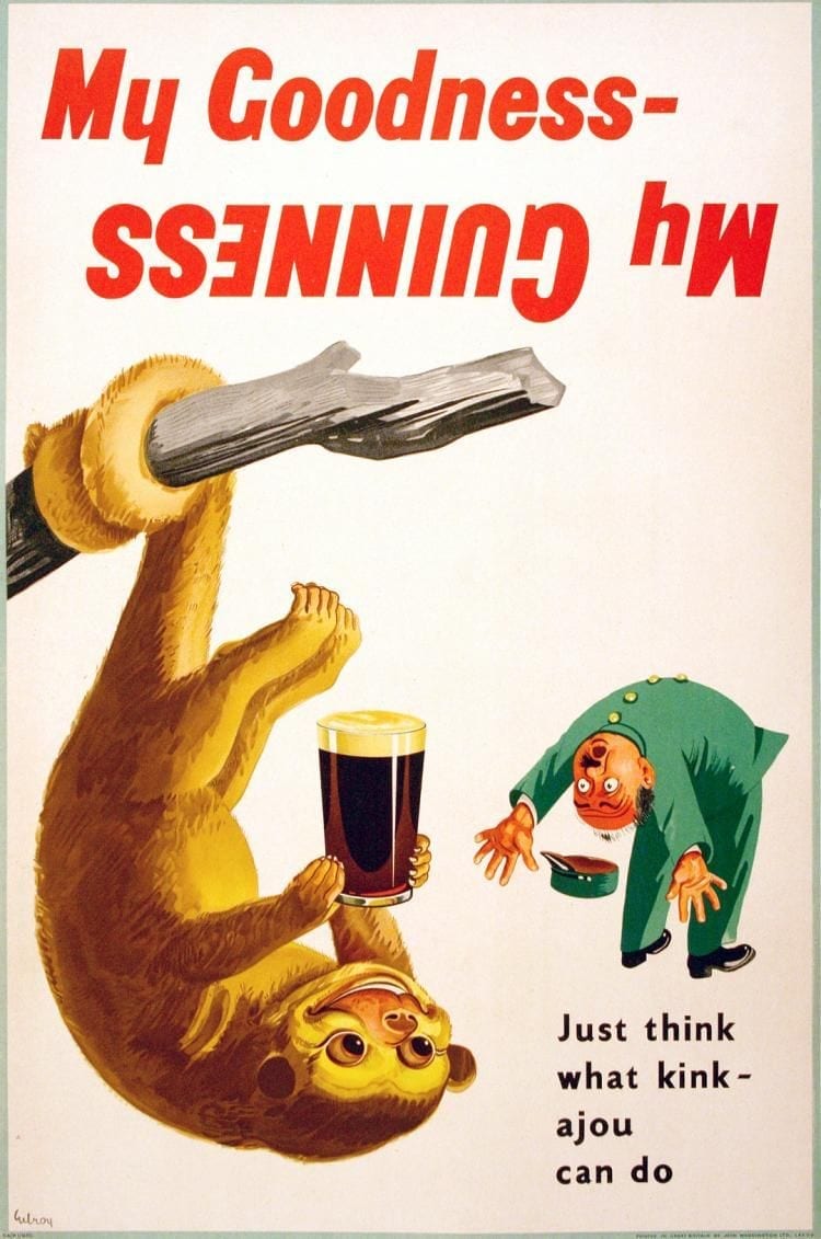
Yummy, silky soft and truly delicious – it can only be Guinness! One of the universe’s greatest gifts, a distillation of flavour and pure human goodwill. Such an enrapturing drink deserves to be painted. But which black should one use to capture the deep velvet cream of this comforting stout – ivory black, lamp black, mars black or vine black? Each type of paint has its own characteristics and story to tell, so which one, if only one, is right for your wee pint? But before we take on this aesthetic challenge we should firmly note that we are painting Guinness, not Guinness Extra Cold – indeed, it would be grotesquely embarrassing if after all your hard work and dedication someone stands in front of your painting and says, ‘My, oh my, what an excellent painting of Guinness Extra Cold!’
Most black pigments are obtained by burning various animal and plant materials. These blacks are all carbon blacks, traditionally produced from charring organic materials like wood. There are many types, each reflecting a traditional method for producing a particular carbon black pigment, whether vine black or the uncommon fruit stone black. Basically, anything you can burn!
The most common of the black pigments you find are ivory, lamp, vine and mars black. The material specifically called carbon black is the most intense in colour and tinctorial power. Black pigment is possibly the oldest of all pigments, alongside the ochres, its use most likely being prompted by the invention of the Zippo lighter back in the Stone Age.
Ivory black is the first contender. The pigment was previously made by killing poor little hippos and elephants and then stealing their ivory teeth and tusks. This practice is now (mostly) frowned upon and expensive so no longer occurs. Nowadays ivory black is simply the misleading name for bone black. This black is the most widely used black; used by practically all artists, whether in oil, watercolour, ink, pure pigment – whatever! It is undoubtedly the all-round black.
The warm brown and grey undertones of ivory black would be useful for capturing the comfort instilled by Guinness, particularly when sat in a cosy pub and doubly enhanced by the addition of a packet of Scampi Fries. However, if using this in oils one should note it is one of the worst pigments to use full strength, or nearly full strength as a film of any other pigment on top is extremely likely to crack as the ivory black moves about. However, instead of being a blob-brush painter you can delicately thin it to a glaze – otherwise it is excellent for making initial wash-like sketches. Nonetheless, away from this totally arbitrary study of a pint of Guinness and the quite conservative teachings of my educational master (Pip Seymour) all the great masters from Mr Caveman, Rembrandt, Picasso and Manet used ivory black with great effect and show that the oft-quoted teaching that black kills a painting is not true (see ‘Berthe Morisot with a Bouquet of Violets’!
In contrast to the warmth of ivory black there is lamp black which is an equally ancient pigment but with a much colder, blue hue. Long ago it was produced by collecting soot from oil lamps. Now it is made from partially combusted mineral and vegetable oil, with the oily residue removed during the manufacturing process. It is an intense colour with great tinctorial strength and a lovely velvety depth. However, it is very transparent and like ivory black in oil it should (technically not artistically) only be used in thin layers because at full strength it will wrinkle and take forever to dry. HOWEVER! As we are painting Guinness, not Guinness Extra Cold, it is wholly inappropriate to consider it any further.
In addition to ivory and lamp black there is the thoroughly trustworthy and modern mars black which was invented in America back when TV didn’t exist and everyone wore hats. The purpose of its invention was to create a black more suitable for watercolour. The process used natural gas as the raw material and the resultant black deposits from burning were of a finer grain than the other blacks, meaning it could spread further in watercolour. Additionally, it is a stable pigment available in all media. If you like your Guinness really warm, then Mars black is for you as it is much warmer than ivory black, which should be perhaps be said as having a cool warmth (does that make sense?) Like ivory and lamp black it has good tinctorial power. However, it is not as saturated in colour as ivory, and some say it is less subtle than other blacks when mixing with other transparent colours.
Lastly, there is vine black which is made from desiccated grape vines. It is a cool, grey black somewhat like lamp black but less deep – shallow you might even say. It does not have the tinctorial strength of the other blacks, but this can be an advantage for the subtle painter, just as zinc white is weaker than titanium white. Yes, there is strength in weakness!
If you have read this blog with a pint of Guinness in your hand you will have seen that Guinness isn’t black at all, more a rainbow of brown, and you will have also realised how stupid and clunky this ridiculous piece has been. However, if you, like me, love Guinness, you could simply ignore all of this and paint Guinness pink, or not even paint it at all, maybe instead you could place a pile of sand, a sheaf of barley, a blob of malt extract and a drip of water onto a table as a deconstructed art piece for this delectable pint.
So, what have we learnt? Ivory black (bone black) is a warm black with brown and grey undertones, it is not vegetarian, it is available in most materials. Lamp black is a cold blue black, it is vegetarian, and it is deep and velvety (like the Black Velvet cocktail – a concoction of Guinness and champagne – what could be better!) Mars black is the new kid on the block with great opacity, warmth and all-round stability and popularity (see acrylics section of shop!). Lastly, there is meek old vine black, a strange wee pigment with a shy demeanour but a subtlety that could perhaps floor the others.
Thank you.
By Ned Elliott
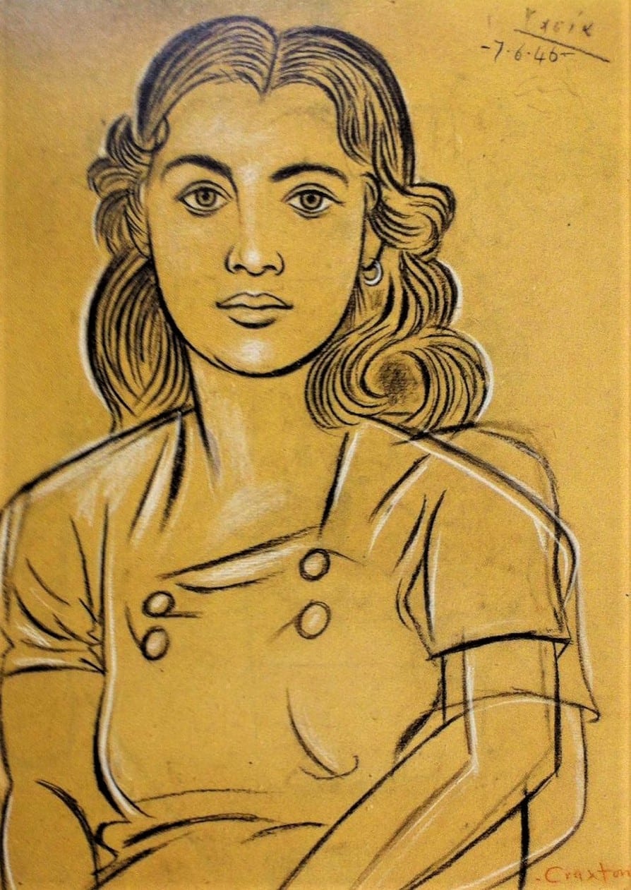
With the days getting longer but somehow the month feeling gloomier it is only natural to pine for summer, both past and future, and the warm joy it brings. Undoubtedly, there is no greater pleasure than jumping into a tree-lined river, throwing yourself under its sun-dappled waters, then lying on the tickling glistening grass and basking in the sun whilst water steams off your pale-turning-brown body. Away from the river another highlight of my England-bound months of smiles was the Charmed Lives in Greece exhibition held at the British Museum. Alongside boys lying in fields of asphodels, slowly drifting into the arms of Morpheus, were a selection of small portraits of Cretan and Greek men, women, and children. Here John Craxton, a British artist who for much of his life exiled himself to Greece (tough life!), not only made me jealous of his Mediterranean gallivants but he also opened my eyes to the world of toned paper! Truly exciting stuff!
Before my eyes were opened by Craxton I lived as an ignoramus blindly wandering around Green and Stone thinking the only paper for me came white, phosphorescent and bright, and that toned paper was exclusive to pastel painters. But no, such paper is open to all – whether you use charcoal, pencil, coloured pencil, conté or pen and ink!
Toned paper comes in all sorts of colours ranging from light creams, bold greens and rich reds. Whilst Craxton enjoyed all sorts of colours of toned paper in the Renaissance we find that light browns and greys were most popular with the likes of Michelangelo and da Vinci. What all these artists understood, whether 15th century, or 20th century, was that toned paper can greatly enhance a drawing.
Having such a choice of delectable colours to draw on allows you to set the mood of your drawing more easily. Whilst Craxton often chose warm tones of yellow and orange he equally favoured cooler ones of grey and blue. Having the constant unifying mid-tone also allows one to darken and lighten their drawings more easily. Indeed, this sort of highlighting which can be done in white charcoal, chalk, white ink, or dry-ish gouache can be more difficult to achieve when drawing on white paper and to some extent allows a more realistic bodied drawing, as when in nature do you ever really see stark white in nature? Equally, coloured paper can lean one further towards abstraction. The constant mid-tone can also grant you wicked speed as the paper does much of the shading work for you, making it perfect for travelling and quick sketch making. Craxton’s ‘Tasia’, a portrait of a Cretan lady drawn in conté, is a beautiful example of the dynamism of toned paper. The paper highlights her warmth, spiralling hair and extraordinarily captured features. No doubt Craxton could have achieved this otherwise, but the paper helps! Finally, using toned paper encourages unusual colour combinations which can prompt all sorts of effects, moods, and experiences.
The only things that will upset toned ‘pastel paper’ is the wet, whether watercolour or acrylic, it will squirm wildly and lose all dignity and be a terrible waste. However, relatively dry gouache and the delicate wetness of pen and ink is perfect. Fortunately, watercolour does come in its own range of hues comparable to those mentioned here.
So next time you think about paper, don’t only think of it as white, at Green and Stone in the ‘pastel paper’ stand it comes in forty different colours (not counting all the other types of card and paper) ready to be made into whatever sort of drawing you like.
By Ned Elliott

New year, new you!
Over Christmas we become flabby, not only physically, but also mentally. By this I mean we can slip artistically and lose aesthetic rigour as we practice the sin of gluttony and let ham seep from our pores. Sadly, there is no easy solution, but with effort one can alleviate their sin – not by dieting, joining the wagon, or sweating at the gym – no, the only way is to don your smock and recreate a fifteenth century masterpiece.
To help you I suggest copying Mantegna’s Agony in the Garden (currently on show at the National Gallery). I have already done so and now feel like twice the man I was in 2018.
This painting exquisitely depicts Judas’s betrayal and the arrest of Christ before going to the cross. In it we see Christ receive the Instruments of the Passion whilst his disciples snooze unaware of the encroaching army of soldiers snaking out of an imagined Jerusalem. Rendered in tempera it has a brilliant luminosity and crispness which is not replicated in the above photo. With the addition of a sweet trio of rabbits nibbling away at the trodden-grass Mantegna makes even the most hardened atheist hearts tingle with the poetry of the Lord!
Here then follows a guide to redemption.
Ingredients:
A rigid wooden panel
Gesso
Egg tempera
Bole
Gold Leaf
A competitive brother-in-law (called Bellini)
Attention to detail
Talent
Start by choosing your wooden panel. If you wish to be truly authentic visit your local madman-in-the-forest and exchange a tuppence for some poplar wood chopped in the autumn. Make sure it is well seasoned and then cut to size (62.9 x 80cm!). Otherwise compressed fibreboard or seasoned panels of birch framed on pine (which we sell in the shop) are suitable.
Prepare your panel by dusting it with a lint-free cloth and degrease it with a delicate wipe of methylated-spirits. Sit the wood happily on some makeshift feet and allow it to thoroughly dry.
Next prepare a delicious vat of gesso.
Again, if you wish to be truly authentic you must make two stops. First, either go to your local pet shop and buy a rabbit or commit a crime and set an illegal snare in the countryside. After you have done this grace your nearby gypsum mine and buy a kilo or two of the powdered rock. If you can’t get a rabbit you may be truly Renaissance and use clippings of goatskin vellum soaked in water for 24 hours.
To spare yourself the horror of the first stage and the lung damage of the second simply go into the downstairs of our shop and buy yourself a bag of rabbit-skin glue and a bag of gypsum, or a tub of whiting.
To make your gesso mix the two ingredients together in a way better explained in Robert Massey’s Formulas for Painters or Pip Seymour’s The Artist’s Handbook.
Now apply a ‘grip coat’ of mostly glue and a smidge of gypsum powder followed by between 4-10 coats of silky smooth and creamy white gesso. You’ll know if your glue is good if it dries to a clear pale straw colour. If it is bad it will dry dark brown and a cloud of shame will rest above you for the rest of your day.
If you don’t want to do any of this you can again skip the process and exchange some sweet dollar for ‘Gessobord’ pre-gessoed panels! Again, available downstairs!
With your panel now ready and gessoed you may begin to think about paint.
To remake this masterpiece, you must use egg tempera which in this modern-age you can buy in tubes! Or you may dedicate yourself to the handmade process more comprehensively and lengthily described in the previously mentioned books. But essentially, raise yourself a hen, collect its eggs, remove the whites, cut open the egg sac, remove the yolk, wet your pigments, mix the two together, and grind, grind, grind with a muller. Et voila!
With the technicalities over you must begin painting as your handmade egg tempera will go smelly after two days. Make sure to paint delicately and lightly with a fine brush otherwise your painting will crack to bits. Once you have added the finishing touches – the swirling silvery hair, the hundreds of tiny pebbles, the glint of the little rabbits’ eyes – the truly final touch can be added – the golden horse!
Yes, if you look closely, atop Trajan’s column (beautifully rendered in plaster at the V&A) sits a golden horse and rider. Of real gold! Not gold paint, no real gold! So that it shines like the sun! What grace!
To do this apply a little bole and delicately apply with your gilders tip the finest gold leaf in the land (available at little ole Green ‘n’ Stone!). Ta da!
If all goes well and you have followed my instructions closely you should end up with a painting which will make your heart glow with the radiance of God and reinvigorate your mind with the sharpness lost over the Christmas period. To 2019, a year for unparalleled artistic endeavour! Using supplies only from Green and Stone!
By Ned Elliott
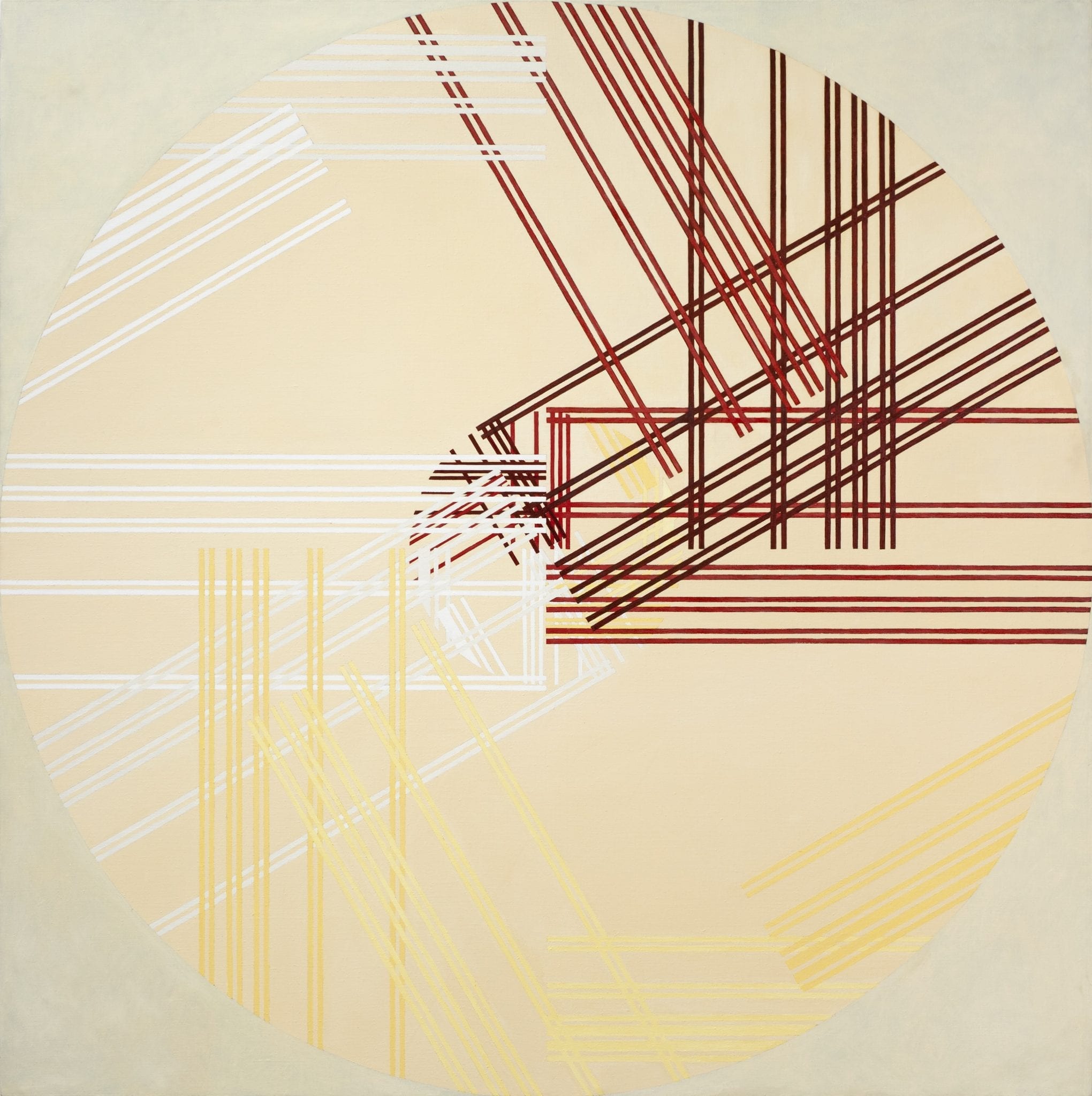
Dodecagon Hypersphere (1995)
Oil on Canvas
180 x 180cm