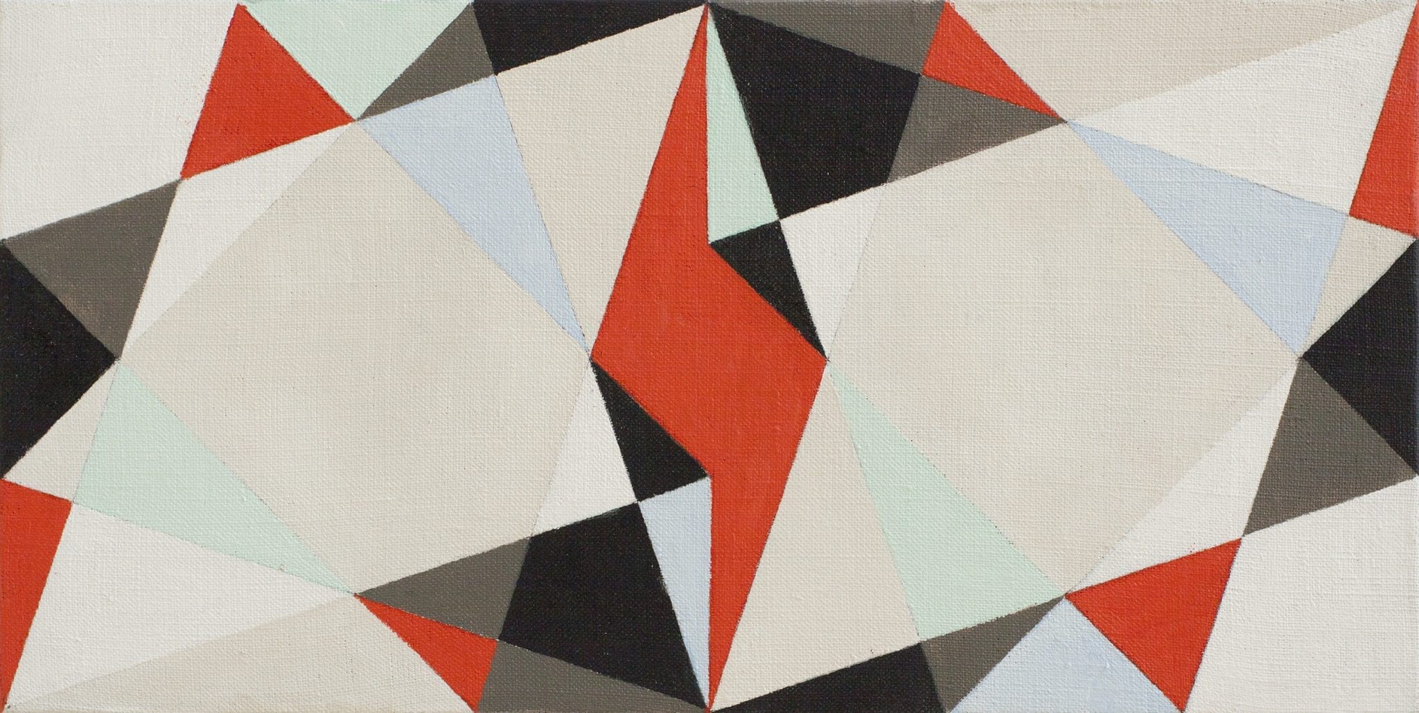
Double Square no 2 small version (2017)
Oil on Canvas panel
19 x 38 cm
Double Square no 2 small version (2017)
Oil on Canvas panel
19 x 38 cm
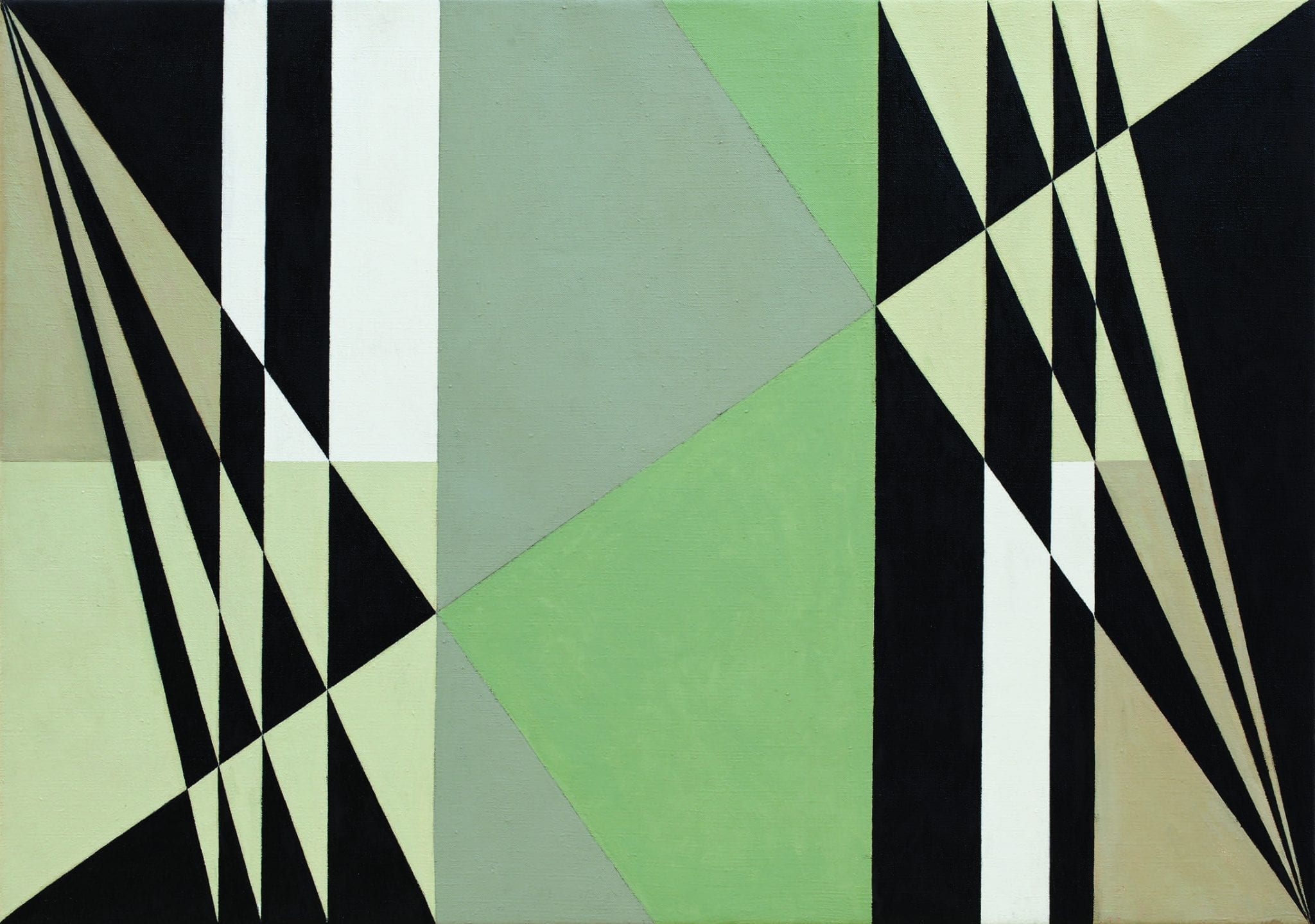
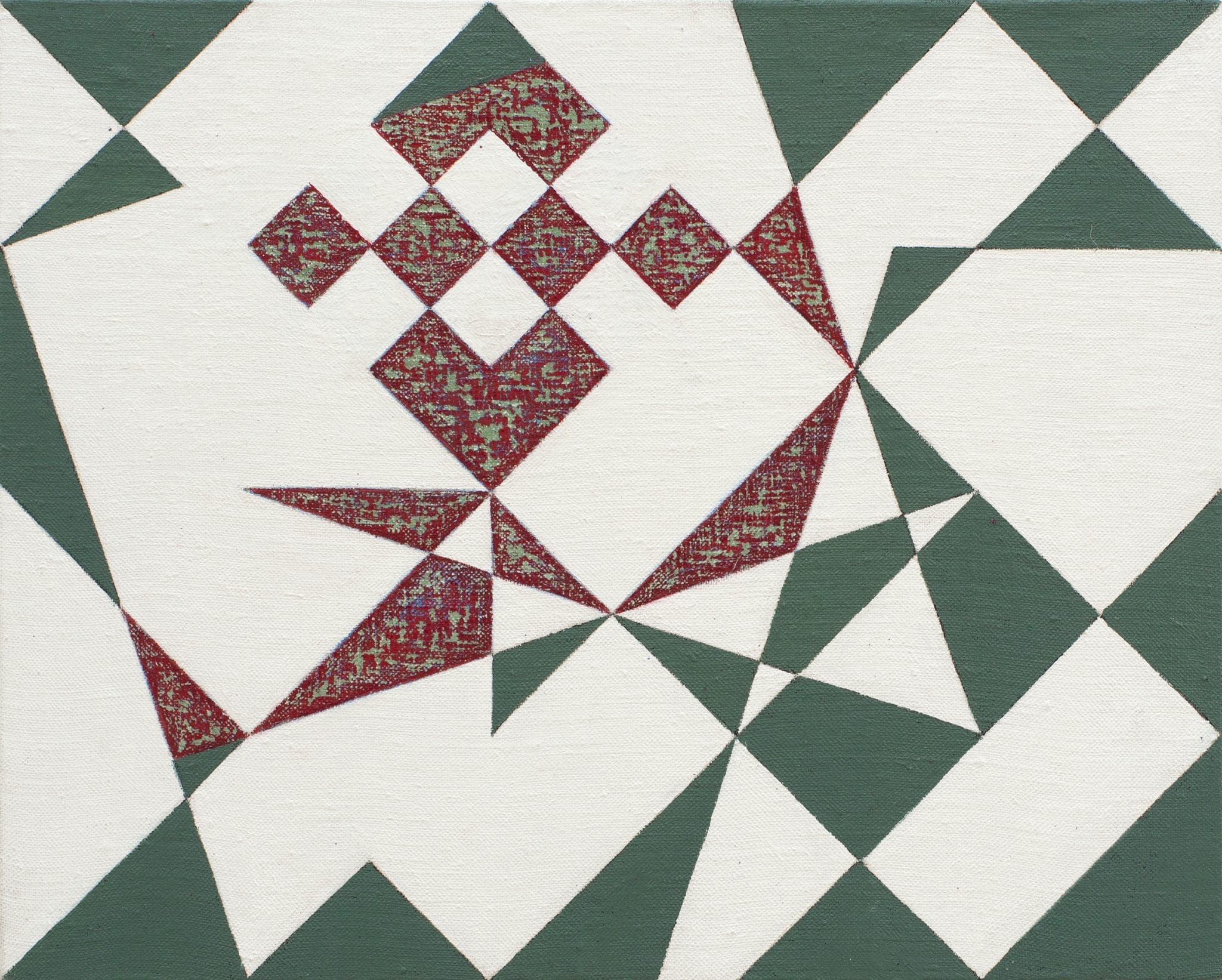
Egalites No. 1 (2011)
Oil on Canvas
61 x 86 cm
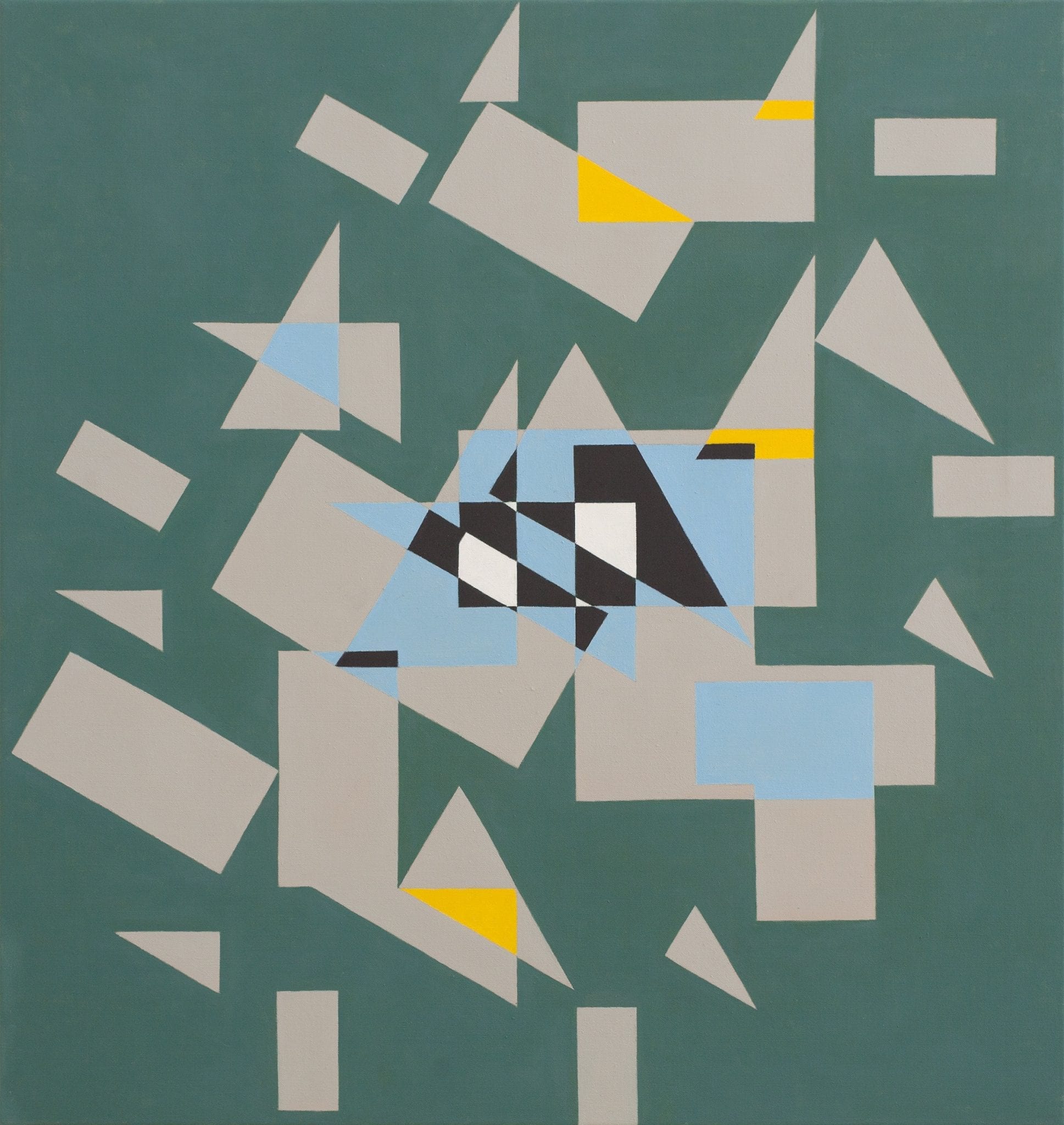
Events Recorded (2017)
Oil on Canvas
96 x 91 cm
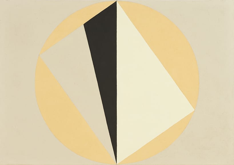
Polymorph (2012)
Oil on Canvas
61 x 86.5 cm
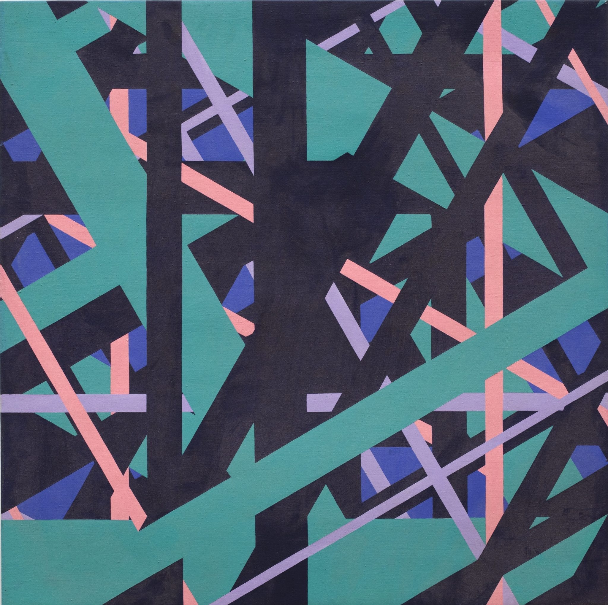
Square Path of Rays – Night (1982)
Acrylic on Canvas
86.5 x 86.5 cm
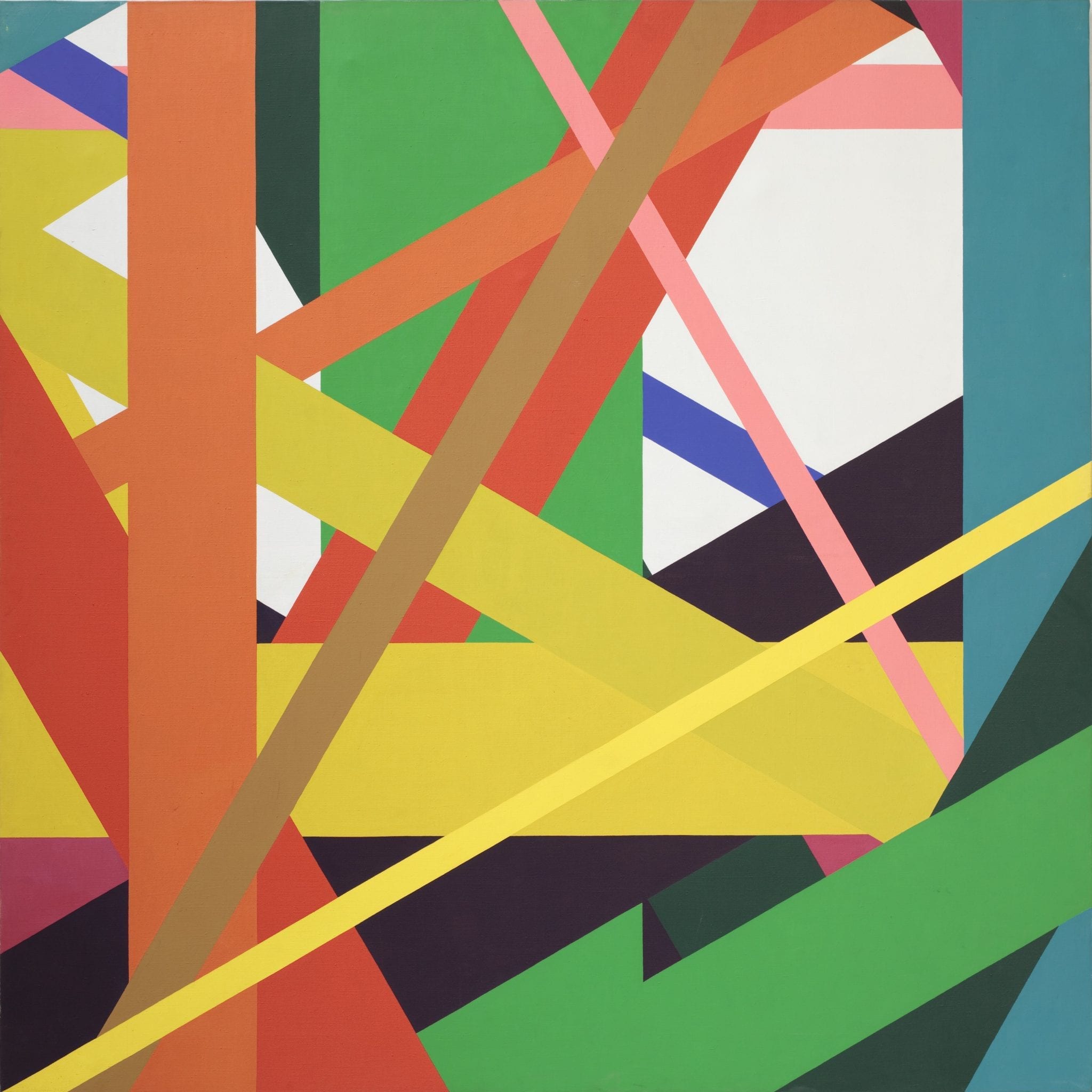
Square Path of Rays No 1 (1980)
Acrylic on Canvas
170 x 170 cm
Within the Tracks (2015)
Oil on Canvas
24 x 30 cm
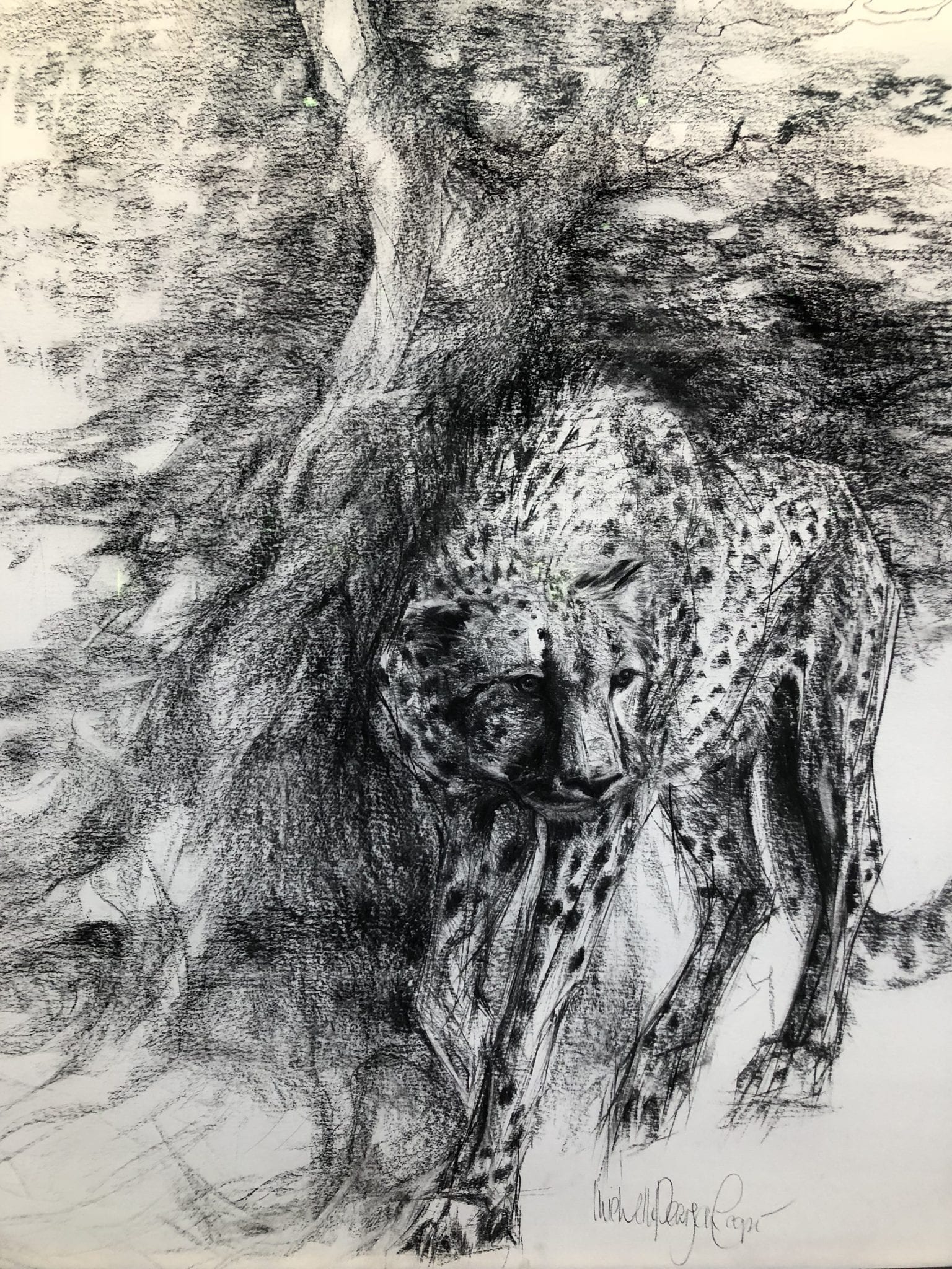
Between 26th October 2018 and 24th January 2019 a raffle is being held at Green and Stone for Michelle Pearson Cooper’s exquisite charcoal drawing ‘Cheetah’.
This piece, measuring 4ft x 5ft and mounted in a handmade frame from Green and Stone, is available to win through purchase of a raffle ticket. Each ticket costs £25 and 50% of the money raised will go to the Artist Benevolent Fund.
To buy a ticket you can either purchase a ticket in person at the shop, or over the phone, or via email.
The winner will be announced on the 24th January 2019.
Good luck!
Michelle Pearson Cooper studied art on a rarely awarded Art Scholarship at Millfield and in Florence under Signorina Simi who lists Annigoni as one of her pupils. Michelle has held 17 solo exhibitions in London, Palm Beach, Marrakech and Dubai, and collectors of her work include HRH The King of Bahrain, Bruce Oldfield, Prince Sadruddin Aga Khan, Mahdi Al Tajir and Tom Stoppard. Inspired by primeval landscapes and their wild creatures, on travels to India, Africa, Oman and the UAE, Michelle has given substance to her ideas born in the silence of the desert and the solitude of the wilderness. She chooses subjects that are powerful and challenging but always her affinity with them is paramount. Her honest approach and distinctive draftmanship is apparent in each faithfully executed drawing, achieving greater perception into their individual characteristics.
Our phone number is 02073520837 and our email is sales@greenandstone.com
Long ago, on a blustery Mediterranean shore, an ancient Roman man slipped and slid across a crumple of rocks in search of booty. After some time, the sodden man found his treasure in a gently lapping pool. Looking down into the octopus’ face the man said, “O poor little octopi, already so delicious and sweet, you are so perfectly exploitable for my own artistic expression.”
And the octopus shed a tear.
*
As our introductory story illustrates sepia is a natural and ancient pigment. It was Cicero in 45BC who first recorded the use of sepia for both drawing and writing in his De Natura Deorum. The famous orator kindly and concisely explained how sepia is made by removing and treating the contents of the ink sacs of various sad cephalopods including cuttlefish and octopus. This makes sepia a strictly non-vegan art material! If you are a vegan, don’t fool yourself! Maybe don’t even read this blog!
True sepia is used exclusively in watercolour and ink as it does not respond well to oil or acrylic. When presented as “sepia” in these latter mediums it contains a mixture of other pigments trying to replicate the rich brown of the real thing. As we don’t deal in knock-offs at Green & Stone we will no longer mention these pale imitations! The true brown of sepia is semi-transparent and depending on its dilution it ranges from a very dark and powerful brown to a delicate glowing light wash. In comparison to the cool greenish-brown of bistre, sepia is a warm reddish-brown similar to burnt umber.
Sepia enjoyed its heyday in the 18th and 19th centuries when it was used by such greats as Turner and Van Gogh. Nowadays, it is not so popular due to its semi-permanent nature. However, this pigment is brilliantly dynamic and exciting to use and if you don’t leave it baking in the sun it’ll be preserved for posterity (see Turner and Van Gogh!).
As mentioned before sepia is used exclusively(!) in watercolour and ink, but in my own wretchedly humble opinion it is most enjoyable as French sepia ink which is an ink mixed with a shellac base. In this form it has a waterproof satin finish. Mixed with shellac the ink gains a light viscosity which, when used with a brush, feels rather silkier and softer than say, Indian ink, and also gives it a little more visible body which shows, when dried on paper, the way one has used their brush. Furthermore, the shellac seems to add to the glow of sepia, giving it extra liveliness. Indeed, having just used the French ink a customer came in and exclaimed, “It’s so dynamic, look!” as she gleefully thrust her paintings in my face.
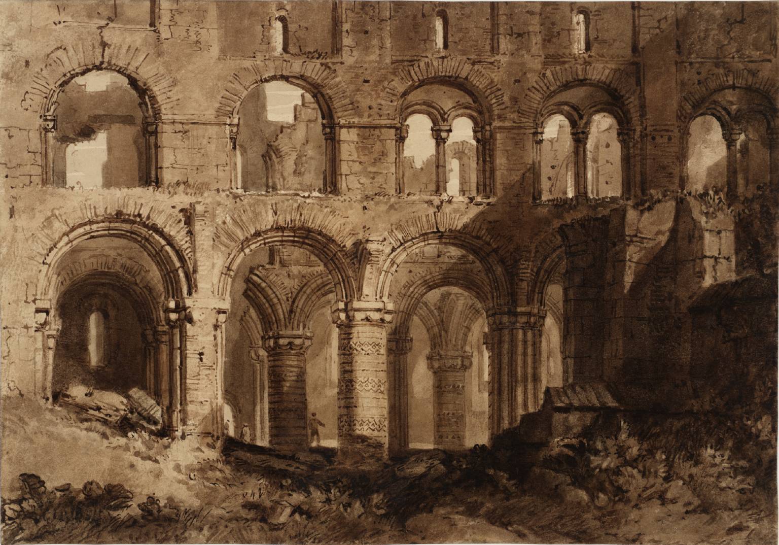
In Holy Island Cathedral (pictured) Turner perfectly shows the depth and range of the “colour” and tones of sepia watercolour by highlighting areas of contrasting light and shade in the ruins. Indeed, sepia is perfect for making monochromatic tonal studies and sketches in preparation for larger works of art in different mediums.
Where Turner mostly used sepia for watercolour painting Van Gogh used it for drawing with a reed dip-pen. Van Gogh’s drawings of peasants farming and trees swirling highlighted the raw, earthen, toilin’ in the fields look of sepia. Undiluted, Van Gogh’s dark mark-making perfectly reflect the warm and gritty rurality of 19th century France.
What more is there to say about sepia? Only to try this slightly maligned colour out, for sketches, studies or full-blown masterpieces!
By Ned Elliott

“Oh my, Gouache!” said the paintbrush to the puddle of paint.
“What?” the puddle replied.
“You are a babe of an aqueous medium! You’re velvety soft, excellently opaque and so, so deeply colourful! I can’t believe I haven’t told you this before.”
Pleased with the surprise barrage of compliments, Gouache could only say “Well gee, thanks, I didn’t want to brag but yeah, I am pretty darn cool aren’t I?” And so, Gouache put on his sunglasses and went on to create some of the most delicious paintings the world would ever see.
*
Gouache itself is a paint made from a mix of pigments, water-soluble gum and chalky filler or white pigment. This ingenious mix, similar but profoundly different to the composition of watercolour, is well known for being a favourite of designers and illustrators but by no means is it limited to such arenas. In fact, gouache can be used in such a way as to mimic oil paint.
The qualities of gouache are numerous. Gouache, with its large amounts of binders and fillers forms a real film with total hiding power. When painted to a full film it has a matt opaque surface which gives it a strength, solidity and weight which sometimes even oil lacks. It is this dried earth look which Matisse cleverly exploited in his cut-outs. The ingredient of the filler or white pigment also gives gouache a light reflecting quality which enhances the strong contrasting values often used in its paintings. However, cool old gouache can do much more than only this.
Standing in the Tate and looking at the pre-Raphaelite paintings of Edward Burne-Jones one might assume their eyes had lain upon an oil, but no, it is quite likely to be a gouache! Once one has overcome such an embarrassing slip-up and apologised to the gallery attendant for being such a sinful idiot one can begin to further appreciate the versatility of this paint. Sidonia von Bork for example shows how gouache can emanate the glow of oil despite its inherent mattness. Burne-Jones also exhibits how gouache can recreate the delicacy, detail and sense of form more familiar in oil and acrylic. Other artists to exploit gouache’s oily mimicry include Anish Kapoor and Egon Schiele.
Arthur Melville is the artist who truly championed gouache. Firstly, Melville showed that whilst watercolours are undeniably superior when used in transparent or semi-transparent washes gouache was perfectly capable too. Indeed, when transparent pigments such as burnt sienna or phthalo blue are used in a wash of gouache they are just as brilliant as that of a watercolour. Secondly, Melville explored the capabilities of gouache by developing a technique whereby he saturated his paper with Chinese white paint and then painted over it. This is why in paintings like The Blue Night, Venice and King Cophetua and the Beggar Maid the colours are so rich, deep and bejewelled. The latter painting also exhibits Melville’s final clever trick which was to manipulate different layers of gouache by using a damp clean brush and sponges to bring covered colours like his Chinese white from below to create ghostly fleeting forms and a velvet-like texture.
Topping off gouache’s all round excellence is that it can be mixed and matched freely with watercolour, ink, pastels and charcoals. A true free spirit! Of course, there are a few things gouache can’t do – it can’t sit out in the rain, it can’t be used in an impasto style, and, positively, it doesn’t become progressively transparent like oil paints can do with age.
If this has all rather tickled your fancy at Green and Stone we stock Winsor & Newton Designers’ Gouache and Schminke Horadam Artists’ Gouache. Designers’ gouache is intended for reproduction work, not permanent pieces. Whilst Artists’ is permanent, lightfast and is intended to create your magnum opus!
By Ned Elliott